Have you ever worked on a project where every button looked slightly different? One page had a rounded blue button, another had a sharp-edged gray one, and somewhere in between, a third button showed up in green with a different font. Nobody planned it that way; it just happened.
That's a design problem most teams run into once they start building beyond a simple prototype. And it's exactly the kind of problem a design system is built to solve.
If you're a developer, designer, or product builder who's just starting to hear the term "design system" thrown around, welcome. This guide is for you. We're going to break it down from scratch, using one of the most satisfying analogies there is: LEGO bricks.
By the end of this article, you'll know:
What a design system actually is (and isn't)
Why teams like Google, IBM, and Salesforce invest heavily in them
How developers and designers use them day to day
How to start thinking about building one yourself
Let's dig in.
What Is a Design System?
A design system is a collection of reusable components, guidelines, and standards that help teams build consistent, scalable digital products. Think of it as the single source of truth for how your product looks and behaves, from buttons and colors to spacing, typography, and animations.
The keyword here is system. It's not just a collection of pretty UI elements. A design system defines the rules for how those elements are built, when they should be used, and why certain decisions were made. It bridges the gap between designers and developers so they speak the same language.
When a design system is done well, anyone on the team, whether they joined yesterday or two years ago, can open it up, grab what they need, and build something that looks and feels like the rest of the product.
That's a big deal.
The LEGO Analogy Explained
Here's the best way to think about a design system: imagine a big box of LEGO bricks.
Each brick is a specific size, shape, and color. Some are long flat pieces, some are tiny connectors, and some are special curved pieces for roofs or arches. But here's the magic — every single brick is designed to snap together. They're all built on the same underlying grid system, with the same connector dimensions.
Because of that, you can build a spaceship, a castle, or a tiny café, and all of the pieces will fit together. No matter which bricks you choose, they were designed to work as a system.
A design system works the same way:
LEGO World
Design System World
Individual bricks
UI components (buttons, inputs, cards)
Brick colors
Color palette/design tokens
Connector dimensions
Spacing and grid system
Instruction manual
Documentation and usage guidelines
LEGO themes (City, Technic)
Product-specific design tokens
Building a house
Building a web page or app screen
Now let's open that box and look at what's inside.
Why Design Systems Matter
Before we get into the anatomy of a design system, let's answer the question every developer eventually asks: "Why can't I just write CSS as I go?"
You can. And at first, it works fine. But as your product grows, you hit a wall.
Imagine you're building a SaaS app with ten screens. You write button styles in one file, copy them to another, tweak them slightly for a new section, and move on. Six months later, you have twelve slightly different button styles scattered across the codebase. Your designer just updated the brand colors. Now you have to hunt through every file to find where buttons are styled.
This is where a design system saves you.
Design systems help teams:
Move faster — grab a pre-built component instead of designing from scratch every time
Stay consistent — every button, card, and form looks and behaves the same way
Scale without chaos — adding a new feature doesn't break the visual coherence of existing pages
Collaborate better — designers and developers share the same vocabulary and the same source of truth
Onboard faster — new team members can learn the system and ship confidently sooner
For large teams, this is non-negotiable. But even solo developers and small product teams benefit enormously from thinking in systems.
If you're building a Rails app, for instance, having a consistent component system means your views stay clean and maintainable. (If you're newer to Rails architecture, the Rails MVC tutorial for beginners is a great place to start before you think about layering a design system on top.)
Core Parts of a Design System
Let's pop the lid off the LEGO box and look at everything inside.
1. Components
Components are the LEGO bricks themselves, the reusable pieces you assemble to build screens.
A component is a self-contained UI element that has:
A specific visual appearance
A defined behavior
Clear rules for where and how it should be used
Common components include:
Buttons: Primary, secondary, danger, disabled states
Text fields: With labels, error states, and helper text
Cards: Containers for grouped content
Modals: Overlay dialogs
Alerts and toasts: Feedback messages
Navigation bars: Headers, sidebars, breadcrumbs
Badges and tags: Status indicators
Dropdowns and selects: Form controls
Tables: Structured data display
Here's a simple example of what a reusable button component might look like in HTML and CSS:
Notice those var(--color-primary-500) values? Those are design tokens, and they're the next piece of the puzzle.
2. Design Tokens
Design tokens are one of the most important concepts in modern design systems, and one of the least talked about at the beginner level.
A design token is a named variable that stores a design decision.
Instead of hardcoding a color value like #3B82F6 in twenty different places, you store it once as a token called --color-primary-500. Now, if the brand color changes, you update one value, and every component that uses it updates automatically.
Think of tokens as the LEGO connector grid, the underlying system that makes all the pieces compatible with each other.
Tokens typically cover:
Token Category
Example
Colors
--color-primary-500: #3B82F6
Typography
--font-size-lg: 1.125rem
Spacing
--spacing-md: 1rem
Border radius
--radius-md: 0.375rem
Shadows
--shadow-card: 0 1px 3px rgba(0,0,0,0.1)
Animation duration
--duration-fast: 150ms
Z-index
--z-modal: 1000
In a Tailwind CSS project, tokens translate directly to config values:
Design tokens are what make a design system truly systematic. Without them, you just have a collection of styles. With them, you have a living, maintainable system.
3. Colors
Your color system is more than just picking colors that look nice together. A well-designed color palette has:
Brand colors: Your primary and secondary identity colors
Neutral colors: Grays used for text, backgrounds, borders
Semantic colors: Colors that communicate meaning (success = green, error = red, warning = yellow, info = blue)
State colors: Hover, active, focus, and disabled variations
Icons are the punctuation marks of a UI. A great icon set has consistent stroke weight, sizing, and visual style, so they all look like they came from the same family.
Most design systems use a curated icon library (like Heroicons, Lucide, or Phosphor) and document which icons to use for which actions. The key is consistency; don't mix a filled trash icon with an outline magnifying glass.
6. Layouts and Grid Systems
Layout rules define how components are arranged on a page. This usually involves:
A grid system: Typically 12 columns on desktop, fewer on mobile
Container widths: max-widths for content areas
Gutters: Spacing between columns
Spacing scale: How much padding and margin to use
Think of the grid as the LEGO baseplate, the foundation everything snaps onto.
A wide card might span 8 columns. A sidebar might span 4 columns. A full-width hero takes all 12.
7. Breakpoints
Breakpoints are the rules for how your layout shifts across different screen sizes. This is the heart of responsive design.
Common breakpoints:
/* Mobile first */
--breakpoint-sm:  640px;   /* Small tablets */
--breakpoint-md:  768px;   /* Tablets */
--breakpoint-lg:  1024px;  /* Laptops */
--breakpoint-xl:  1280px;  /* Desktops */
--breakpoint-2xl: 1536px;  /* Large screens */
In Tailwind CSS, you use these as prefixes: md:flex, lg:grid-cols-3, sm:text-lg. This ensures components look great on a phone just as well as on a wide monitor.
8. Animations and Motion
Motion design is often treated as decoration, but good animation is functional. It helps users understand what just happened, a modal fading in, a success message sliding into view, and a button changing state when clicked.
A design system documents:
Duration values: How long transitions should take (fast: 150ms, normal: 250ms, slow: 400ms)
Easing curves: The acceleration/deceleration profile of animations
Specific interaction patterns: What happens on hover, focus, click, or drag
Documentation is the instruction manual that comes with the LEGO box.
A great design system without documentation is like a box of LEGO bricks with no instructions. You can figure some things out by looking at the pieces, but you'll waste time, make wrong assumptions, and build things the wrong way.
Good documentation covers:
What each component is for and when to use it (and when not to)
Live examples: Interactive previews of components in different states
Do's and don'ts: Visual guides showing correct vs. incorrect usage
Code snippets: Ready to copy and use
Accessibility notes: ARIA attributes, keyboard navigation, and focus management
Changelog: What changed between versions
Tools like Storybook have become the standard for documenting component libraries, since they let you view and interact with components in isolation.
Design System vs. UI Kit
These two terms get confused a lot.
UI Kit
Design System
A collection of visual assets (often in Figma)
A complete system including logic, code, and rules
Primarily for designers
For designers and developers
Usually static
Living, versioned, and maintained
Shows what components look like
Defines how they behave, when to use them, and how to build them
A UI kit is a deliverable. A design system is an infrastructure. One is a snapshot; the other is a living product.
Design System vs. Component Library
A component library is a subset of a design system. It's the coded implementation of the components, the actual HTML/CSS/React/Rails partials that developers use.
A design system is broader. It includes the component library plus the design tokens, documentation, usage guidelines, accessibility standards, brand guidelines, and the process for maintaining all of it.
If you're deciding between Rails/Hotwire and React for your frontend, the Hotwire vs. React comparison for 2026 breaks down the tradeoffs in depth, and both approaches can benefit from a solid design system underneath.
How Designers Use Design Systems
For designers, a design system means never starting from a blank canvas again.
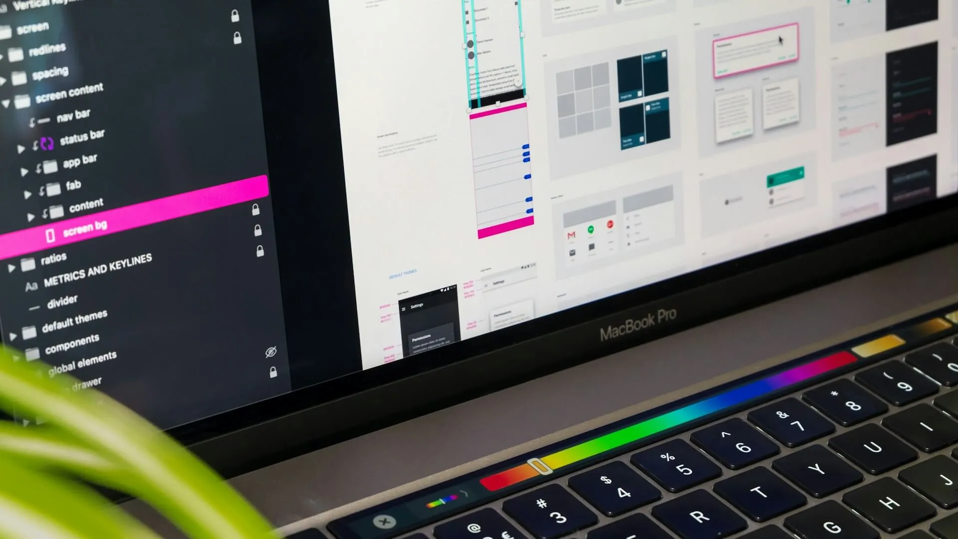
In tools like Figma, a design system lives as a shared component library. Designers drag and drop pre-built components into their mockups, knowing the developer can implement them exactly as shown, because the code already exists.
Benefits for designers:
Speed: No recreating buttons and cards for every new screen
Handoff clarity: Developers know exactly how to build what they see
Focused creativity: Spend creative energy on layout, UX flow, and user problems, not redrawing buttons
Confidence: Every decision aligns with the brand and system
The best design systems create a tight feedback loop: designers explore new patterns, developers implement them, and both update the shared system so the next person benefits.
Real-World Design System Examples
Let's look at three of the most influential design systems in the industry.
Material Design (Google)
Who uses it: Google, Android app developers, and web developers worldwide.
Why it exists: Google needed a unified visual language across hundreds of products, Search, Gmail, Maps, YouTube, Docs, so users always felt at home regardless of which product they were using.
What makes it successful: Material Design introduced the concept of material, a metaphor where UI elements behave like physical surfaces with depth, shadow, and elevation. It gave developers an opinionated system they could adopt wholesale, with clear rules for motion, color, and typography. The result: millions of apps that feel familiar to Android users without each team building their own visual language.
Who uses it: IBM product teams and enterprise software builders.
Why it exists: IBM builds complex enterprise products, dashboards, developer tools, and data platforms. Carbon exists, so all of those products feel like they come from the same company, even when they were built by different teams in different countries.
What makes it successful: Carbon is open-source and extremely well-documented. It has separate implementations for React, Angular, Vue, and Web Components, which makes it flexible for any tech stack. It also has a strong focus on accessibility, critical for enterprise tools used by a diverse workforce.
Why it exists: Salesforce is a platform and an ecosystem. Third-party developers build apps that run inside Salesforce, and Lightning ensures those apps look and behave consistently with the core product, so users don't feel like they've stepped into a completely different product when using a third-party tool.
What makes it successful: Lightning is laser-focused on enterprise UX and accessibility. It has a rich set of design tokens, detailed ARIA documentation, and component blueprints that work in pure CSS, no JavaScript framework required.
Polaris (Shopify): Shopify's design system, focused on e-commerce admin interfaces. Remarkably well-documented, with strong content guidelines alongside UI guidelines.
Atlassian Design System: Powers Jira, Confluence, and Trello. Includes design tokens, accessibility documentation, and a component library that spans multiple products and platforms.
Building a Simple Design System
You don't need a team of twenty to start benefiting from a design system. Here's a minimal version you can start with today.
Start with the components you use most often: buttons, form inputs, and cards. Implement them using your tokens so they're fully connected to the system.
Step 3: Document as you go
Even a simple COMPONENTS.md file with usage notes and examples is infinitely better than nothing. Document the why behind each decision, not just the what.
Step 4: Use it consistently
Enforce the system. Resist the urge to write one-off styles. Every time you add an exception, you chip away at the system's value.
Common Mistakes Beginners Make
1. Building too much too soon. Start small. You don't need 60 components on day one. Start with 5–10 and grow from there.
2. Skipping documentation. A component without documentation is a liability. Future-you (and your teammates) will thank you for writing it.
3. Not using design tokens. If you're hardcoding color values everywhere, you're not building a system, you're building a stylesheet.
4. Building in isolation. Developers and designers should build the system together. A component library that the design team doesn't use (or vice versa) is a missed opportunity.
5. Never updating it. A design system is a product, not a project. It needs ongoing maintenance, versioning, and communication about changes.
6. Over-engineering early. Don't spend three weeks building a perfect token architecture before you've shipped a single component. Iterate.
Easier code reviews, "use the Card component" is clear feedback
Faster onboarding for new team members
More time for interesting problems instead of visual minutiae
For designers:
Faster prototyping
Consistent handoffs with developers
More time for UX thinking and user research
For product teams:
Consistent user experience across the whole product
Faster time-to-market for new features
Easier design audits and brand refreshes
Better accessibility by default
For the business:
Reduced development costs over time
Faster iteration cycles
Brand consistency at scale
Challenges of Design Systems
Design systems are powerful, but they're not free.
Initial investment is high. Building a solid foundation takes real time. You're not shipping features while you set up tokens and document components.
Adoption is the hardest part. A design system only works if people actually use it. Getting buy-in across design and engineering takes effort and communication.
They can slow you down early. When your product is tiny and changing rapidly, a strict system can feel like overhead. Know when to reach for the system vs. when to experiment freely.
Maintenance is ongoing. Every product change is potentially a system change. Who owns it? Who reviews changes? Who communicates updates? These are real organizational questions.
They can become outdated. A neglected design system is worse than no design system, because teams don't trust it and work around it.
Key Takeaways
A design system is a collection of reusable components, guidelines, and tokens that help teams build consistent, scalable products.
Think of it like LEGO, individual bricks that all fit together because they were designed to a shared standard.
Design tokens are named variables that store design decisions (colors, spacing, typography) and make the system maintainable.
Components are the reusable UI building blocks, buttons, inputs, cards, modals, and more.
Design systems help teams build faster, stay consistent, and scale without chaos.
Real-world examples like Material Design, Carbon, and Lightning show how large teams manage design at scale.
You can start small, a handful of tokens and a few well-documented components is a design system.
FAQ
Q: Do I need a design system for a personal project?
Not necessarily. For a small personal project, a design system might be overkill. But adopting a few habits, like using CSS custom properties for colors and spacing, pays dividends fast, even solo.
Q: What's the difference between a design system and a style guide?
A style guide is typically a document describing visual standards (colors, fonts, logo usage). A design system is a living, coded system that includes the style guide plus components, tokens, documentation, and implementation guidelines.
Q: Do I need to build my own design system, or can I use an existing one?
Both are valid. Many teams adopt an open-source system (like Material Design or Carbon) and customize it for their brand. Others build their own for more control. For most early-stage products, starting with an existing system and customizing it is the fastest path.
Q: How does a design system relate to accessibility?
A good design system bakes accessibility in. Color contrast ratios, keyboard navigation, focus states, and ARIA attributes are all of this is defined at the component level, so every team member benefits without having to think about it from scratch each time.
Q: Can I use a design system with Ruby on Rails?
Absolutely. Rails developers often use ViewComponent, Phlex, or well-organized partials as their component layer. Pair that with a thoughtful CSS token system, and you have a lightweight but effective design system for your Rails app. If you're curious about adding dynamic behavior, AJAX and asynchronous JavaScript integrate naturally with Rails and your component architecture.
Q: What tools do teams use to build design systems?
For design: Figma (component libraries, design tokens). For code: Storybook (documentation + development environment), Style Dictionary (token management), Tailwind CSS (utility-first system). For Rails: ViewComponent, Phlex, or BEM-organized partials.
Q: How does a design system help with developer collaboration?
When everyone uses the same components, code reviews focus on logic and behavior instead of "why does this button look different?" It also reduces the number of one-off CSS classes that accumulate over time. For teams using Git workflows, consistent components mean cleaner diffs and easier-to-understand PRs, pairing well with a solid Git workflow and alias setup.
Conclusion
A design system is one of those investments that feels like overhead at first, until the day you need to change your brand's primary color, and it takes five minutes instead of five days.
Think of it as your LEGO box: well-organized, clearly labeled, and designed so that anyone who opens it can build something great.
You don't have to build everything at once. Start with tokens. Add a few components. Write a little documentation. Use it consistently. Iterate.
Over time, you'll build something that makes your whole team faster, your product more consistent, and your codebase genuinely enjoyable to work in.
That's what a design system is really for.
Want to keep building? If you're working with Rails and building a blog or content platform, the step-by-step guide to building a blog with Rails 8 is a great next project to apply what you've learned about consistent component design.
💌 Don’t miss out! Join my newsletter for web development tips, tutorials, and insights delivered straight to your inbox.